How We’re Making Publicly Available Data More User Friendly

Who will you meet?
Cities are innovating, companies are pivoting, and start-ups are growing. Like you, every urban practitioner has a remarkable story of insight and challenge from the past year.
Meet these peers and discuss the future of cities in the new Meeting of the Minds Executive Cohort Program. Replace boring virtual summits with facilitated, online, small-group discussions where you can make real connections with extraordinary, like-minded people.
We live in an age of data. Big companies like Google and Amazon are using data to refine their products and target advertising. Researchers and planners are using data to come up with ways of improving where we live.
But is data something that non-experts can use, for their jobs or everyday use?
The Data Is Out There
There is a ton of free, high-quality, public data released by government agencies, which can be used by anyone. This data could help a student with a project, help a small organization find areas of need, or help a city planner get a quick overview of their area.
There is an abundance of data available for public download. The Census Bureau alone has a huge amount of valuable information, going down to the neighborhood-level. There’s the basic stuff: race, age, income, things like that. And that’s incredibly useful. But maybe you’re interested in something more specific: language spoken at home, people with GEDs, people without health insurance.
The Data Isn’t Easy To Use
And there’s a lot more data available than the Census data. The Bureau of Labor Statistics has unemployment and industry data. The Centers for Disease Control and Prevention (CDC) has an incredible amount of health data. Want high school graduation rates? The National Center for Education Statistics has that. Broadband availability? Federal Communications Commission (FCC). Flood zones? Federal Emergency Management Agency (FEMA).
And that’s not even considering some of the affordable proprietary data available for purchase, covering topics like home sales, vacancy, and school performance.
It’s good data, and it can be used to make decisions on how to solve real problems.
But there’s a problem: It’s not always easy to find or to use. The data you want may come from three different sources. It might not be clear which indicators are right for you. It might not be clear what data is valid. It might not be clear how to download it. And even if you get that far, you may have seven different files from four websites, all with differently formatted data that you need to clean.
Data comes in many formats; there’s long format data, there’s wide format data, there are XLS files, there are CSV files. American Community Survey (ACS) Census Bureau summary files have their column headers in a different file. There’s a lot of great data from Longitudinal Employer – Household Dynamics, but accessing it requires downloading and processing almost a terabyte of data, far beyond the capacity of an inexperienced data user.
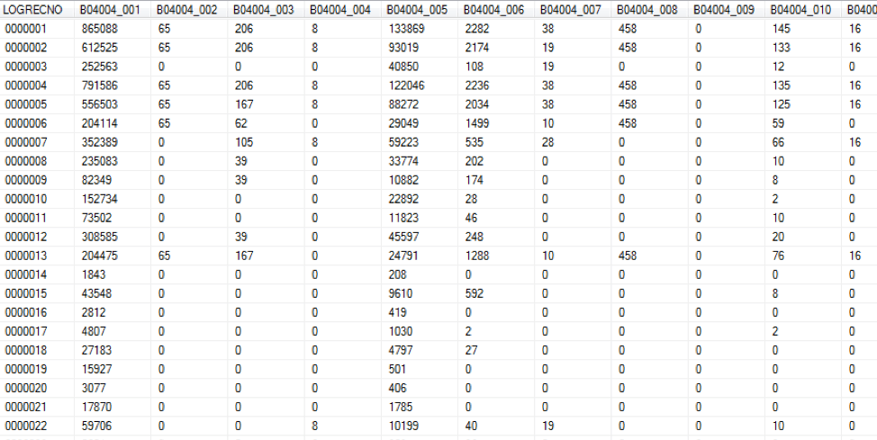
How ACS data looks.
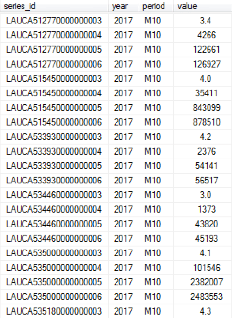
How BLS unemployment data looks.
Oh, and good luck getting it on a map, unless you’ve taken GIS classes.

Typical GIS toolbar.
There are enough obstacles that people who could really benefit don’t take advantage of what’s available.
Make Data Easier to Access
And that’s how PolicyMap came into being. It was started by a community development financial institution (Reinvestment Fund, in Philadelphia), almost ten years ago. They had the in-house expertise to obtain and work with the data, but saw how many other similar organizations didn’t, and how much access to data would help them.
PolicyMap is two things: It’s an online data warehouse and a mapping platform.
Building a Data Warehouse
We have a whole team dedicated to data. We’re keeping track of data updates, looking for new data, validating data, deciding what data is useful and what data is isn’t, and writing clear labels describing what the data is.
On our website, users can easily find the data they want by either navigating our thematic menus (Demographics, Health, Education, Economy, etc.), or by searching for specific terms. And just like that, they have the data. Data is downloadable in a consistent, usable format.
We’ve gotten so adept at keeping our data simple to use and up-to-date that some larger entities subscribe to our API, just so they can get all the data they need from one place.
Mapping Platform
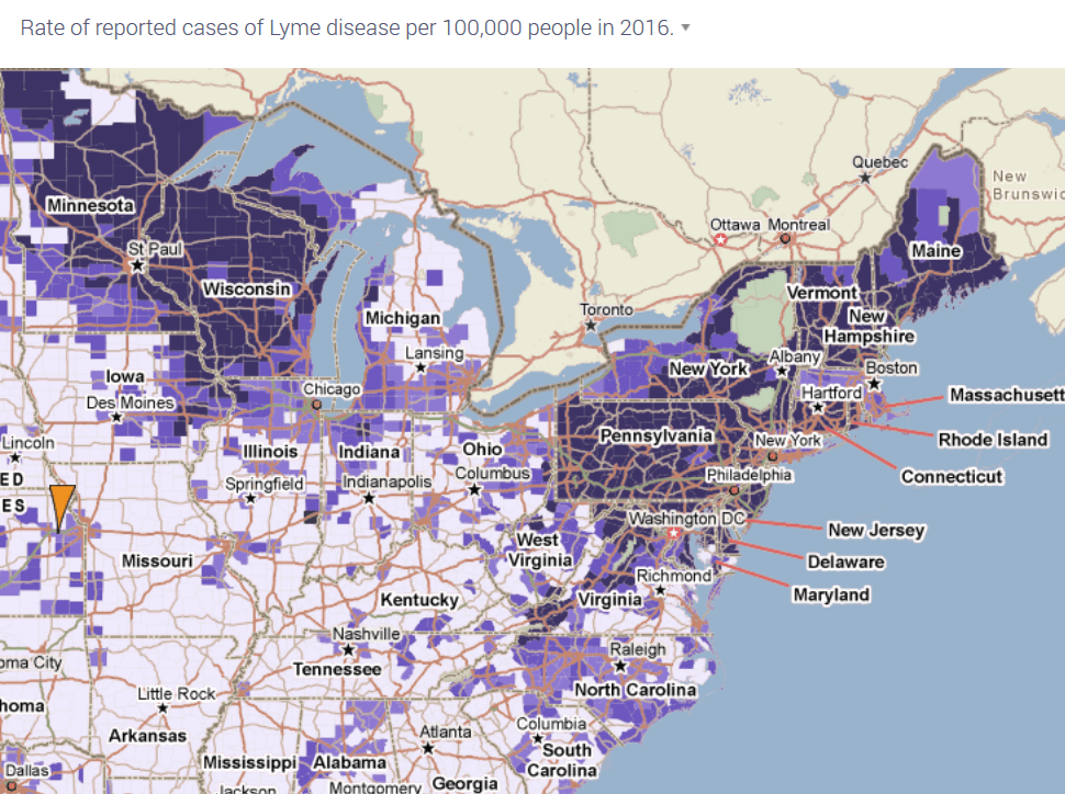
Most of PolicyMap’s users want the data for a specific purpose: To put it on a map. And so, as our name implies, that’s the first thing you get when you open an indicator on our site. Maps can show distinct patterns, such as where poverty exists, where high-paying jobs are, or where diseases are prevalent.
It also makes it easy to get exact values for a specific place; type in an address, and immediately know the median income for your neighborhood.

Desktop GIS applications are amazingly advanced in the analytical tools they offer, but are also notoriously difficult to use, even for trained professionals. PolicyMap offers an alternative when what you really need is to map the data. Of course, advanced users can use PolicyMap to download the data, and then run their more advanced analyses.
PolicyMap offers an analytical tool of its own: 3-Layer Maps. You can choose one, two, or three indicators, and find areas that match specific criteria. For example, if you wanted to find areas in your city where Supplemental Nutrition Assistance Program (SNAP) benefits are being underutilized, you might bring up data on poverty and SNAP recipients, and show areas where poverty is high, but SNAP use is low. Then use that information to fix a problem.
Make Data Available for Everyone
If data is publicly available, it’s free to access on PolicyMap, for anyone. That’s been one of our core principles from the beginning, even though charging for everything would be more lucrative. We do offer subscriptions, with data from private sources, and additional features, like 3-Layer Maps, reports, and the ability to load your own data. We also have relationships with organizations, businesses, and governments to make custom applications for their purposes.
But at the end of the day, what’s important is that data is available for everyone.
Discussion
Leave your comment below, or reply to others.
Please note that this comment section is for thoughtful, on-topic discussions. Admin approval is required for all comments. Your comment may be edited if it contains grammatical errors. Low effort, self-promotional, or impolite comments will be deleted.
Read more from MeetingoftheMinds.org
Spotlighting innovations in urban sustainability and connected technology

Middle-Mile Networks: The Middleman of Internet Connectivity
The development of public, open-access middle mile infrastructure can expand internet networks closer to unserved and underserved communities while offering equal opportunity for ISPs to link cost effectively to last mile infrastructure. This strategy would connect more Americans to high-speed internet while also driving down prices by increasing competition among local ISPs.
In addition to potentially helping narrow the digital divide, middle mile infrastructure would also provide backup options for networks if one connection pathway fails, and it would help support regional economic development by connecting businesses.

Wildfire Risk Reduction: Connecting the Dots
One of the most visceral manifestations of the combined problems of urbanization and climate change are the enormous wildfires that engulf areas of the American West. Fire behavior itself is now changing. Over 120 years of well-intentioned fire suppression have created huge reserves of fuel which, when combined with warmer temperatures and drought-dried landscapes, create unstoppable fires that spread with extreme speed, jump fire-breaks, level entire towns, take lives and destroy hundreds of thousands of acres, even in landscapes that are conditioned to employ fire as part of their reproductive cycle.
ARISE-US recently held a very successful symposium, “Wildfire Risk Reduction – Connecting the Dots” for wildfire stakeholders – insurers, US Forest Service, engineers, fire awareness NGOs and others – to discuss the issues and their possible solutions. This article sets out some of the major points to emerge.

Innovating Our Way Out of Crisis
Whether deep freezes in Texas, wildfires in California, hurricanes along the Gulf Coast, or any other calamity, our innovations today will build the reliable, resilient, equitable, and prosperous grid tomorrow. Innovation, in short, combines the dream of what’s possible with the pragmatism of what’s practical. That’s the big-idea, hard-reality approach that helped transform Texas into the world’s energy powerhouse — from oil and gas to zero-emissions wind, sun, and, soon, geothermal.
It’s time to make the production and consumption of energy faster, smarter, cleaner, more resilient, and more efficient. Business leaders, political leaders, the energy sector, and savvy citizens have the power to put investment and practices in place that support a robust energy innovation ecosystem. So, saddle up.


0 Comments